
The purpose of this artifact is to showcase the logo design process, from initial sketches to rough drafts, to a refined version, and ultimately the final logo. This artifact will appeal to people who want to understand the logo design process better and see how I can take an initial logo sketch and refine it into one worthy of a corporate identity. In this example, the logo needed to be easily recognizable and scalable, and to convey that the clinic is holistic.

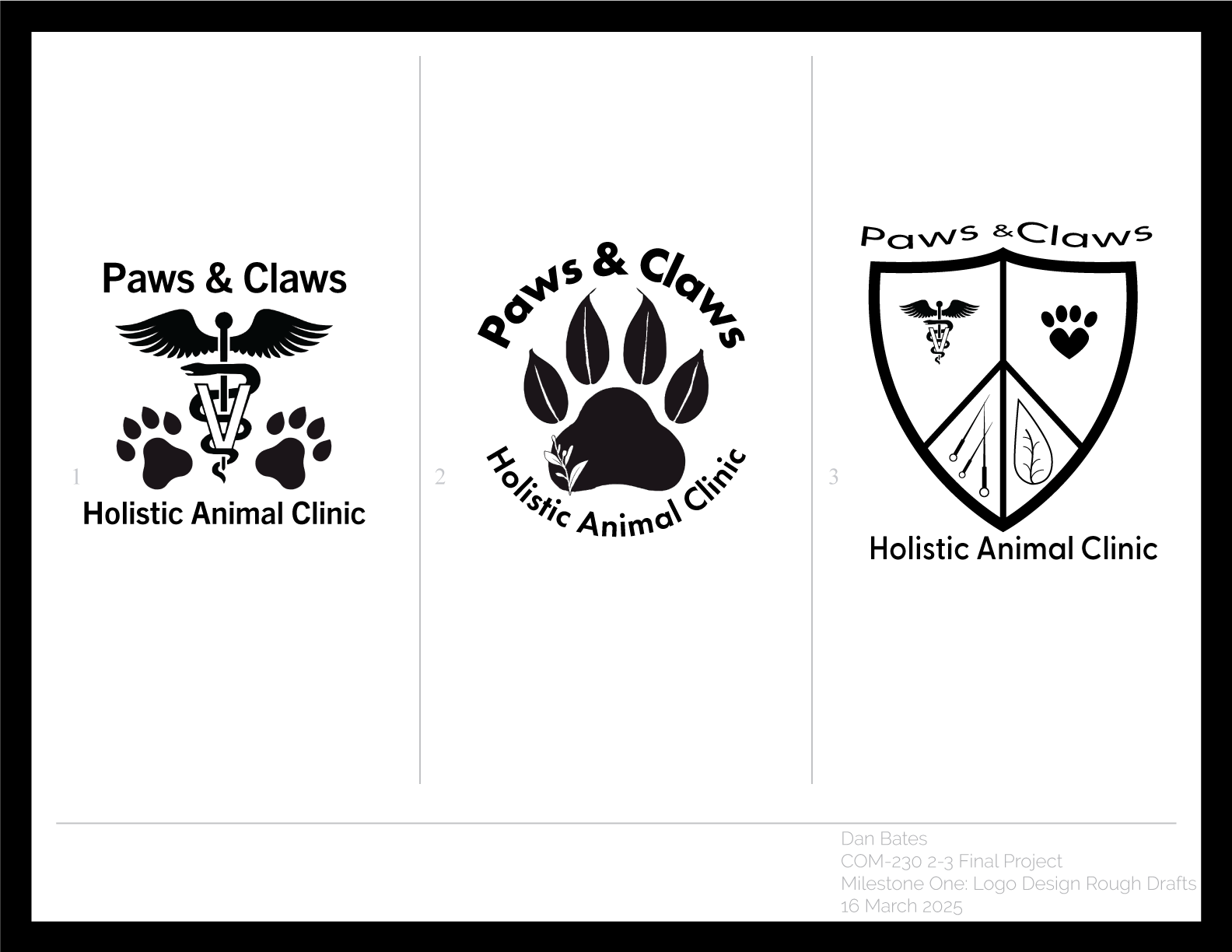


The overall concept I went with is simplicity. This logo meets the audience requirements by using an earthy color palette, and a paw print that incorporates leafs and claws. It is readily scalable, from an image as small as 1” tall (I test printed it), to usage on roadside billboards. It communicates a holistic message by using the leafs as the paws’ toes, showing how the clinic incorporates natural healing methods when treating its animal patients. The elements and principles of symmetry, contrast, and repetition were used to create this logo.
I really enjoyed creating this logo and the various iterations that ultimately led to the final logo. This logo shows that I can design a logo with enough detail to clearly convey a message (a paw print with leafs for toes), while remaining simple enough that the details won’t disappear when printed at smaller scales. It shows that I don’t only think about what looks good on my monitor when designing, I also consider how the design will be used and make sure it will work in all use cases.
